
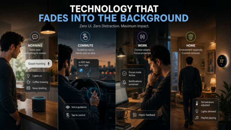
Half of global web traffic comes from mobile devices, so businesses that prioritize mobile users are not only enhancing their user experience but also gaining advantages in search engine rankings. If your website isn’t optimized for mobile, you risk losing valuable traffic and potential customers.
For companies operating in the B2B space, mobile optimization also plays a direct role in how decision-makers research vendors, compare services, and evaluate potential partnerships. Buyers often review websites during quick moments throughout the day, whether between meetings or while traveling, so a responsive site ensures that key information, product details, and contact options remain easy to access. When a business website loads quickly and presents information clearly on smaller screens, it builds credibility and encourages further engagement with potential clients.
Mobile performance also contributes valuable insights when measuring marketing effectiveness across channels. Many organizations rely on structured performance tracking to understand how prospects interact with their digital presence and move through the buying journey. Using a system guided by a B2B marketing KPIs framework allows teams to monitor website traffic quality, lead generation, and conversion behavior across mobile and desktop environments, helping businesses refine their strategies and maintain steady growth in competitive markets.
What is Mobile First Web Design?
A mobile first design strategy focuses on building websites starting with mobile devices and then scaling up for larger screens. This approach ensures that your site performs optimally on smaller screens, where user demands are highest. By putting mobile users first, businesses can cater to their largest audience while staying competitive.

Principles of Mobile First Design
1. Responsive Layouts
Responsive web design is at the core of mobile first strategies. This means starting with layouts optimized for small screens and scaling them up for tablets, laptops, and desktops. Responsive designs ensure your website looks and functions beautifully, regardless of the device being used.
2. Touch Friendly User Interface
Mobile users interact with websites using touch gestures. Ensuring your UI is touch friendly, like designing buttons and links that are large enough to tap easily, enhances usability. A great user interface increases engagement and reduces frustration.
3. Fast Load Times
Mobile connections can often be slower, so optimized load times are important. Compressing images, minifying code, and leveraging caching are just a few techniques to reduce load times and improve performance. Faster websites not only enhance user experience but also positively impact SEO rankings.
Why Mobile First Design Matters for SEO
Search engines like Google prioritize mobile friendly websites in their rankings. With mobile first indexing, Google uses the mobile version of your site as its primary source for determining rankings. If your website isn’t mobile friendly, you’ll likely see a drop in search visibility.
By implementing a mobile first strategy, you can:
- Improve user engagement because visitors are more likely to stay on a well designed mobile site.
- Reduce bounce rates, which positively impacts your search engine performance.
- Boost conversions by creating a great browsing experience on mobile devices.

The Benefits of Mobile First Web Design
1. Enhanced User Experience
Mobile first websites prioritize the needs of users. They provide a smooth, intuitive experience, which builds trust and encourages repeat visits. When users can navigate easily and find what they need, they’re more likely to engage with your business.
2. Broader Audience Reach
With more people accessing the internet on mobile devices than ever before, a mobile first strategy ensures your website is accessible to the widest possible audience. Catering to mobile users means you’re meeting your customers where they are.
3. Competitive Advantage
A mobile first design isn’t just a technical upgrade, but a business advantage. Companies that invest in mobile optimization are able to gain an edge over competitors who neglect this important aspect of web design.
How to Get Started with Mobile First Design
Implementing a mobile first strategy begins with understanding your audience’s needs. Start by analyzing your website traffic to determine the percentage of visitors coming from mobile devices. From there, work with developers to create:
- Responsive layouts that adjust to different screen sizes.
- Fast loading pages by optimizing assets and reducing unnecessary elements.
- Accessible designs that cater to touch based interactions and varying connection speeds.

Final Thoughts
Prioritizing mobile users improves customer satisfaction, enhances SEO rankings, and positions your brand for success in a mobile world. Don’t wait for your competitors to take the lead, embrace a mobile first strategy today and set your business apart!
When websites, booking systems, and customer touchpoints are designed with smaller screens in mind, brands communicate professionalism and care, which naturally builds confidence and loyalty. This focus on accessibility also encourages faster decision-making, smoother enquiries, and stronger engagement, all of which contribute to long-term growth.
As operations become more digital and customer interactions increasingly happen online, businesses that plan ahead tend to reduce friction and risk, aligning their day-to-day processes with the expectations of a modern audience.
That same forward-thinking mindset often extends beyond marketing into how a business protects itself while serving the public. Whether work happens on client premises, at events, or through face-to-face services, understanding exposure and responsibility becomes part of sustainable growth, and choosing public liability insurance that suits your type of work fits naturally into this broader planning.
It supports confidence when engaging customers, collaborating with partners, or expanding services, knowing that unexpected incidents will not derail progress. When strategic visibility, customer trust, and practical protection work together, businesses are better positioned to grow steadily while staying focused on innovation rather than uncertainty.