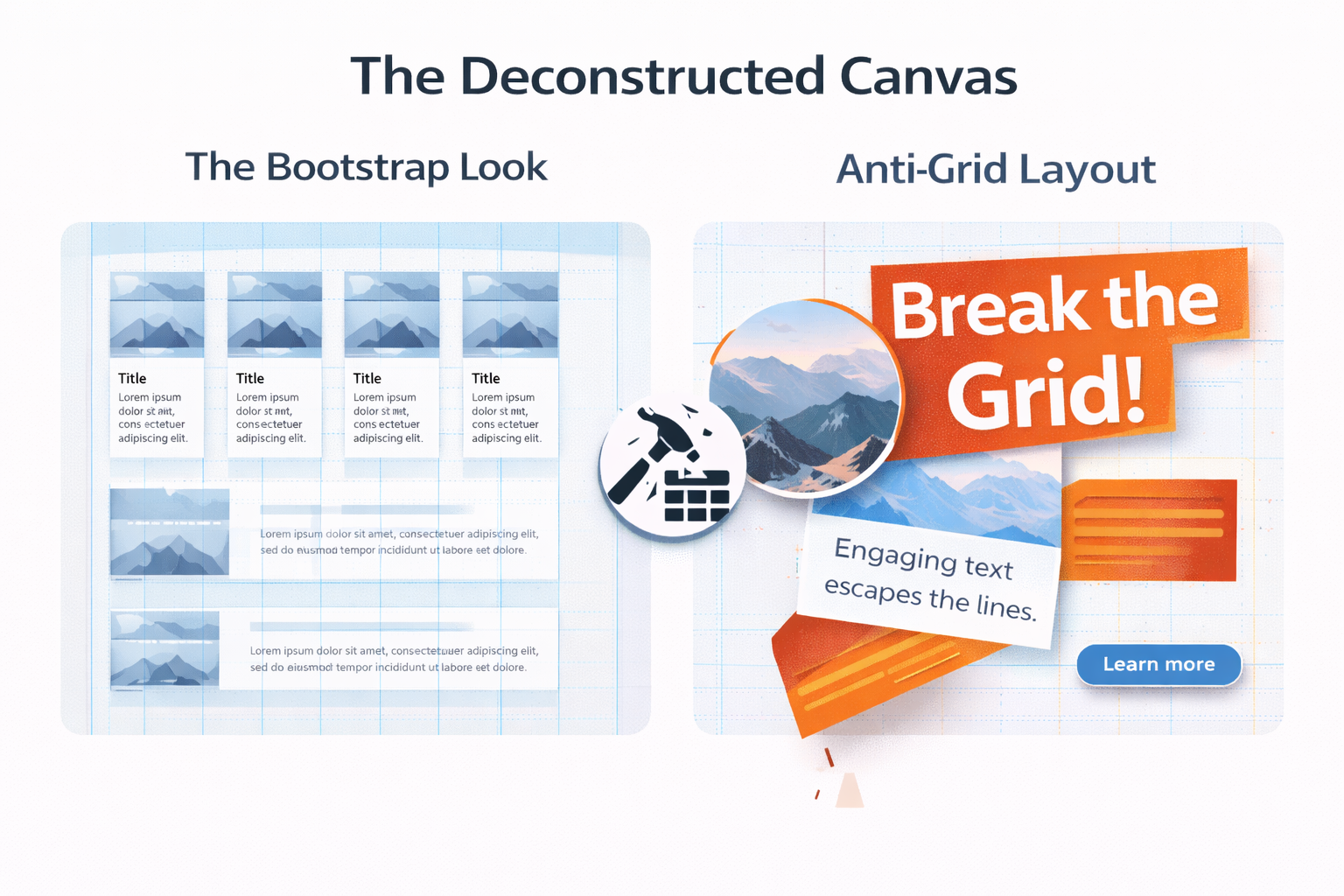
For over a decade, the web has been framed by a rigid, predictable skeleton. The 12-column grid—championed by frameworks like Bootstrap—brought order, responsiveness, and speed to development. But in its ubiquity, a visual sameness emerged: the “Bootstrap look.” Now, a wave of designers is leading a deliberate and creative revolt. Through the intentional use of Anti-Grid Layouts, they are breaking the sterile, boxy conventions to create websites that are visceral, memorable, and emotionally resonant. This movement isn’t about chaos; it’s about calculated asymmetry, depth, and a return to artistic composition on the digital canvas.
The Tyranny of the Grid: When Efficiency Stifles Expression
Initially, the grid was a liberating tool. It provided a much-needed structure for a wild web. However, its overuse has led to a landscape where countless sites—from startups to corporate portals—feel mechanically assembled from the same Lego set. Consequently, user experience has become predictable, and brand differentiation has suffered. Therefore, the “Bootstrap look” is now shorthand for a safe, templated aesthetic that prioritizes developer convenience over unique user engagement. This saturation has sparked a necessary counter-movement.
Principles of the Anti-Grid: Composition Over Alignment
Anti-Grid Layouts are not about deleting the grid entirely. Instead, they are about subverting it, working with artistic principles that predate CSS frameworks. Essentially, the goal is to create dynamic tension and guided focus.
- Asymmetry & Dynamic Balance: Rather than mirroring elements across an axis, anti-grid designs use uneven weighting. A massive, bold headline might be offset by a small, distant element, creating visual interest and motion. Balance is achieved through contrast in scale, color, or texture, not through symmetrical placement.
- Layering & Depth: The flat, card-on-background paradigm is shattered. Elements overlap, bleed off the viewport, and exist on perceived different planes. Subtle shadows, mixed transparencies, and parallax scrolling are used to create a tangible sense of depth, making the interface feel more like an environment and less like a spreadsheet.
- Broken Rhythm & Intentional White Space: The predictable rhythm of repeating rows and columns is disrupted. An oversized image might break into a text column; a block of content might be strategically isolated in a sea of negative space. Here, white space is not just a margin but an active, sculptural component of the design.
- Fluid, Organic Shapes: In contrast to the relentless rectangles of grid systems, anti-grid designs incorporate custom illustrations, fluid blobs, and irregular contours. These organic forms soften the digital experience and create natural pathways for the eye to follow.
Implementing the Rebellion: A Guide to Thoughtful Anarchy
Adopting an anti-grid philosophy requires a shift from assembly to artistry. Crucially, it must still serve usability.
- Start with a Focal Point, Not a Grid: Decide on the one element that must capture attention. Build the compositional hierarchy around this point, using scale and placement to guide the user’s gaze emotionally.
- Use a Baseline Grid, Then Deviate: Typography should remain anchored to a baseline grid for readability. Let this consistent vertical rhythm become the stable foundation from which other elements (images, shapes, video) dramatically depart.
- Code with Modern Tools: The anti-grid is enabled by modern CSS. Master
grid-template-areasfor intentional asymmetric layouts, useclip-pathfor custom shapes, and employobject-fitandaspect-ratiofor more fluid image control. Frameworks like Tailwind CSS, which are utility-first, offer more compositional freedom than opinionated component kits. - Test Relentlessly for Usability: The greatest risk is creating a beautiful puzzle that users cannot solve. Responsive behavior requires even more careful planning. A daring desktop layout may need to collapse into a more conventional, single-column mobile flow to maintain clarity.
Conclusion: The Purposeful Imperfection
Ultimately, the rise of Anti-Grid Layouts signifies web design’s maturation into a true medium of artistic expression. It is a conscious move away from the homogenized, efficient, and often impersonal “Bootstrap look.” By strategically breaking the rules of rigid structure, designers can forge deeper emotional connections, communicate brand personality instantly, and create digital experiences that feel human, crafted, and alive. In the end, this movement proves that on the web, compelling communication is not always aligned, balanced, or boxed—sometimes, it is beautifully, purposefully imperfect.