
Why Website Color Choice Matters
When meeting with a client a few weeks ago, I was presenting a website I had meticulously designed for them. Everything seemed to be going well—they loved the layout, the content was spot on, and the images perfectly captured the essence of their brand. But as we wrapped up, they hesitated. “It’s all great,” they said, “but something just doesn’t feel right.”
Curious, I asked if it could be the color scheme. They seemed doubtful. “I like the color blue,” they insisted. But I couldn’t shake the feeling that the colors were the culprit. So, before our next meeting, I decided to experiment with a different color scheme. I carefully selected hues that not only aligned with their brand but also enhanced the overall user experience. When I showed them the revised design, their reaction was immediate. “This is it!” they exclaimed. The colors suddenly made everything click—the site felt more cohesive, more inviting, and exactly how they had envisioned it.

This experience reinforced for me just how critical thoughtful color selection is in web design. It’s not just about choosing colors that look good; it’s about selecting ones that evoke the right emotions, align with the brand’s message, and create the best possible experience for the user.
The Impact of Website Colors on User Experience
Website colors play a pivotal role in shaping user experience. The right color palette can guide users through your site, evoke specific emotions, and enhance overall usability. When colors are strategically chosen, they help create an intuitive navigation flow, making it easier for visitors to interact with your content. For example, using contrasting colors for call-to-action buttons ensures they stand out, prompting users to take desired actions. On the other hand, poorly selected colors can cause confusion, strain the eyes, and even drive users away. Understanding how colors impact user experience is crucial for creating a website that is not only visually appealing but also highly functional and user-friendly.

How Colors Influence Brand Perception
Colors are more than just aesthetic choices; they are powerful tools that influence how your brand is perceived by your audience. Each color carries its own psychological impact, and when used effectively, can reinforce your brand’s identity. For instance, blue is often associated with trust and professionalism, making it a popular choice for financial institutions. In contrast, vibrant colors like red and orange can convey energy and urgency, which are perfect for brands that want to stand out and create a sense of excitement. By understanding the psychology of color, you can align your website’s color scheme with your brand values, ensuring that every visitor gets the right impression from the moment they land on your site.


First Impressions: The Role of Color in Website Design
First impressions are formed within seconds, and color is one of the first elements users notice when they visit your website. The color scheme you choose can set the tone for the entire user experience, influencing how your site is perceived right from the start. A well-chosen color palette can convey professionalism, trustworthiness, and creativity, while a poorly chosen one can leave users feeling uncertain or disconnected. In competitive online spaces, where users can easily move on to the next site, making a strong first impression is vital. By leveraging color effectively in your website design, you can capture attention, communicate your brand’s essence, and encourage users to explore further.
Understanding Color Psychology in Web Design
Color psychology is a powerful tool in web design that goes beyond mere aesthetics. It involves the strategic use of colors to influence how users perceive and interact with a website. Each color triggers different emotions and reactions, making it essential to choose a palette that aligns with your brand’s message and goals. Whether you’re aiming to evoke trust, excitement, or calmness, understanding the psychological impact of colors can help you create a website that resonates with your audience. In this guide, we’ll explore how color psychology works in web design and how you can leverage it to enhance user experience, build brand loyalty, and drive conversions.
The Basics of Color Psychology for Websites
Color psychology is fundamental to effective web design, as it focuses on how different colors can influence user behavior and perceptions. Understanding the basics of color psychology allows web designers to create more intentional and impactful websites. For instance, certain colors can encourage users to take specific actions, such as using red for urgency or green for trust. By strategically selecting colors that align with your brand’s goals and your audience’s expectations, you can create a more engaging and memorable user experience. This knowledge is essential for any web designer looking to enhance the effectiveness and appeal of their websites.
How Different Colors Evoke Emotions
Colors have the power to evoke a wide range of emotions, making them a crucial element in web design. For example, blue is often associated with calmness and trust, making it a popular choice for businesses in healthcare and finance. On the other hand, red can evoke excitement and urgency, which is why it’s frequently used in e-commerce to drive conversions. Understanding how different colors affect emotions enables you to craft a website that resonates with your audience on a deeper level. By tapping into these emotional responses, you can guide user behavior, enhance brand perception, and ultimately drive engagement and sales.
Cultural Significance of Colors in Web Design
When designing websites for a global audience, it’s important to consider the cultural significance of colors. Different cultures can interpret colors in varying ways, which can impact how your website is perceived internationally. For example, while white is often associated with purity and simplicity in Western cultures, it can symbolize mourning in some Eastern cultures. Understanding these cultural nuances helps you avoid potential missteps and ensures your color choices resonate positively with all users. By taking cultural significance into account, you can create a website that is not only visually appealing but also culturally sensitive, making it more effective in reaching a diverse audience.
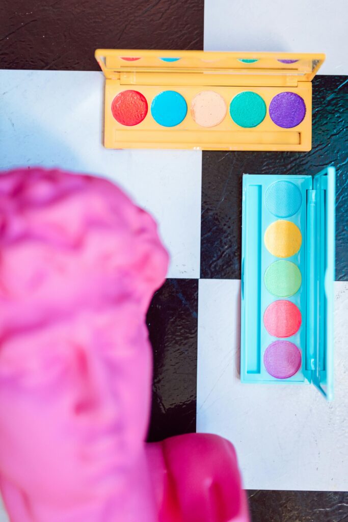
Primary Colors for Websites: The Basics
Primary colors are the foundation of any effective color scheme in web design. Understanding how to use primary colors—red, blue, and yellow—is crucial for creating a visually cohesive and impactful website. These colors are the building blocks from which all other colors are derived, and they can significantly influence the overall look and feel of your site. Whether you’re aiming for a bold, vibrant design or something more subtle and balanced, mastering the basics of primary colors will help you establish a strong visual identity that resonates with your audience. In this guide, we’ll explore how to effectively incorporate primary colors into your web design strategy to enhance user experience and brand perception.
Choosing Your Primary Website Color
Selecting the right primary color for your website is a crucial decision that can significantly impact user experience and brand identity. Your primary color sets the tone for your entire site, influencing everything from navigation to user engagement. When choosing your primary website color, consider your brand’s personality and the emotions you want to evoke. For example, blue is often associated with trust and professionalism, making it a popular choice for corporate websites. On the other hand, a bold red can create a sense of urgency or excitement, which is ideal for e-commerce platforms. By aligning your primary color with your brand’s core values and target audience, you can create a visually cohesive and impactful website that leaves a lasting impression.

Complementary Colors: Building a Color Palette
Once you’ve chosen your primary website color, the next step is to build a harmonious color palette using complementary colors. Complementary colors are those that sit opposite each other on the color wheel, such as blue and orange or red and green. These colors naturally enhance each other, creating a balanced and visually appealing design. Incorporating complementary colors into your website helps to highlight key elements, improve readability, and guide user attention to important areas like call-to-action buttons or special offers. By carefully selecting and combining complementary colors, you can create a cohesive color palette that not only looks great but also enhances the overall user experience.

How to Use Color Theory in Web Design
Color theory is a fundamental principle in web design that involves understanding how colors interact and the effects they have on user perception. By applying color theory, web designers can create visually pleasing and effective websites that communicate the right message to their audience. For instance, analogous color schemes—using colors that are next to each other on the color wheel—can create a serene and harmonious look, while triadic color schemes—using three evenly spaced colors—offer a more vibrant and dynamic feel. Knowing how to use color theory allows you to make informed decisions when designing your website, ensuring that your color choices are not only aesthetically pleasing but also functional and aligned with your brand’s objectives.
Wrapping Up Your Web Design Strategy
In conclusion, understanding and mastering the use of color in web design is essential for creating a website that not only looks great but also performs well. From choosing the right primary color to building a harmonious color palette with complementary hues, every decision you make can influence how users perceive your brand and interact with your site. By applying principles of color psychology and color theory, you can design a website that resonates with your audience, evokes the right emotions, and drives engagement. Whether you’re aiming for a bold, attention-grabbing design or a calm, professional look, the thoughtful use of color is key to achieving your goals. Start experimenting with colors today, and watch how a well-crafted color scheme can elevate your website’s overall user experience and brand presence.