If you’ve ever built a product across multiple platforms—web, iOS, Android—you’ve felt the pain. The button that looks perfect on desktop suddenly feels off in the mobile app. The brand blue renders differently across browsers. The spacing that worked beautifully in Figma becomes a nightmare in code.
This fragmentation isn’t a developer problem. It’s a communication problem. And it’s solved by something called design tokens. This challenge is central to any cross-platform app development strategy, where maintaining visual consistency across frameworks is a constant battle.
At Bright Bridge Web, we’ve seen how design tokens transform chaotic, inconsistent products into seamless, scalable experiences. Here’s why they’ve become the secret weapon of teams building for multiple platforms.
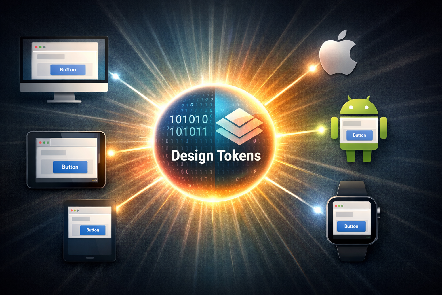
What Are Design Tokens, Really?
Let’s strip away the jargon. A design token is a single, named variable that stores a visual design attribute—like color, typography, spacing, or animation—in a platform-agnostic format.
Think of it as a universal translator between design and development.
Instead of saying:
- “Use blue #007AFF for the primary button on iOS”
- “Use blue #6200EE for the primary button on Android”
- “Use blue #1A73E8 for the primary button on web”
You create a single token: color.primary
Every platform then interprets that token using its native language:
- iOS:
UIColor(named: "color.primary") - Android:
R.color.color_primary - Web:
var(--color-primary)
One decision. One source of truth. Perfect consistency.
Why Design Tokens Matter Now More Than Ever
1. Multi-Platform is the Default
Your users don’t care if they’re on iPhone, Android, desktop, or tablet. They expect the same brand experience everywhere. Design tokens make that possible without duplicating work. Whether you’re building native apps or Progressive Web Apps , tokens ensure a unified experience.
2. Speed and Scale
When your design system uses tokens, changing the brand color takes minutes, not days. Update one token, and every instance across every platform updates automatically.
3. Consistency Without Compromise
Designers work in Figma. Developers work in code. Design tokens create a shared language that bridges the gap. What designers specify is exactly what developers implement—no translation errors, no guesswork.
4. Accessibility Built-In
Tokens can bake accessibility directly into the system. Instead of remembering “text on primary must have 4.5:1 contrast,” you create tokens that enforce it. If a designer picks an invalid combination, the system flags it.
Anatomy of a Design Token System
A mature token system has layers of abstraction:
Primitive Tokens (The Raw Materials)
These are the pure, atomic values with no semantic meaning.
blue-50: #E3F2FDblue-500: #2196F3blue-900: #0D47A1spacing-4: 4pxfont-size-md: 16px
Semantic Tokens (The Meaning Layer)
These assign purpose to primitive tokens.
color-primary: blue-500color-primary-hover: blue-700color-text-on-primary: whitespacing-button-padding: spacing-4font-size-button: font-size-md
Component Tokens (The Application Layer)
These tie semantic tokens to specific components.
button-primary-background: color-primarybutton-primary-text: color-text-on-primarybutton-primary-padding: spacing-button-padding
This three-layer approach creates flexibility. You can change the underlying blue without affecting the meaning of “primary.” You can reassign “primary” to a different color without touching every button.
How to Implement Design Tokens
1. Start with Your Primitives
Identify your foundational values. Colors, typography scales, spacing units, border radii, shadows, and animation durations. These should be named for what they are, not what they do.
2. Define Semantic Meanings
Map your primitives to purposes. What is your primary brand color? Your background color? Your error color? Your heading font size? This layer is where design intent becomes explicit.
3. Structure Component Connections
Decide which semantic tokens apply to which components. A button uses color-primary, a card uses color-surface, a heading uses font-size-heading.
4. Choose a Format
The W3C Design Tokens Community Group is working to standardize token formats across the industry. Popular token formats include:
- W3C Design Tokens Format: Emerging industry standard
- Style Dictionary: Amazon’s open-source build tool
- Figma Tokens: Plugin for managing tokens in design files
- CSS Custom Properties: Native web implementation
5. Automate Sync Between Design and Code
The magic happens when your design tool and codebase share the same tokens. Tools like Figma Tokens, Zeroheight, and Supernova can sync token changes automatically.
Real-World Impact
Case Study: A Global E-Commerce Brand
Before implementing design tokens, this brand maintained three separate design systems—web, iOS, Android. A simple button redesign required three teams, three QA cycles, and three separate launches. Changes took weeks.
After implementing tokens:
- One change updated all three platforms simultaneously
- Designer-developer handoff became seamless
- QA time dropped by 60%
- Brand consistency across platforms reached 100%
The Bottom Line: Consistency at Scale
Design tokens aren’t just a technical implementation detail. They’re a strategic investment in your product’s future. They enable teams to move faster, maintain quality at scale, and deliver the seamless experiences users expect.
In a world where users interact with your brand across dozens of touchpoints, inconsistency is a silent brand killer. Tokens are the cure.