

The Small Details That Make a Big Difference: Micro-Interactions Done Right
You click a button. It subtly depresses, then rises. A checkmark appears. The form submits. You didn’t consciously notice any of it. But if those tiny responses were missing, something would feel… off.
These small, purposeful moments are micro-interactions—the subtle feedback loops that tell users their action was received, understood, and processed.
At Bright Bridge Web, we see micro-interactions as the secret ingredient between a functional website and a genuinely satisfying one. But here’s the catch: they must serve function, not flash.
What Are Micro-Interactions?
A micro-interaction is a single, contained moment of interaction between user and product. It has four parts:
- Trigger: What starts the interaction (user click, page load, system event)
- Rules: What happens during the interaction (animation, state change)
- Feedback: What the user sees/hears/feels (visual change, sound, haptic)
- Loops & Modes: What changes long-term (saved preferences, learned behavior)
Common examples you encounter daily:
- A button changing color when hovered
- A pull-to-refresh animation
- A like button that animates when tapped
- A form field that highlights red when input is invalid
- A toggle switch that slides with haptic feedback
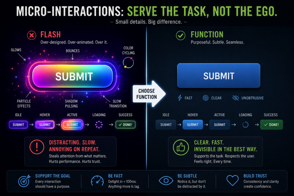
The Problem: Flash Without Function
Not all micro-interactions are created equal. The web is full of examples that prioritize spectacle over substance:
- The Slow Animation: A menu that takes 800ms to slide open. Users wait. Frustration builds.
- The Pointless Bounce: A button that bounces playfully but provides no actual feedback about its action.
- The Attention-Seeking Element: Everything pulses, glows, or shakes. Nothing feels important because everything does.
- The Novelty That Wears Off: A clever animation that’s charming the first time and annoying the 50th.
These are micro-interactions that prioritize flash over function. They harm usability, slow down users, and erode trust.
Principles of Functional Micro-Interactions
1. Feedback First, Delight Second
The primary job of any micro-interaction is to answer the user’s unspoken question: “Did that work?”
- A button click should show immediate visual feedback (color change, depression)
- A form submission should show loading state, then success or error
- A drag-and-drop should show positional feedback in real time
Delight is a bonus. Clarity is mandatory.
2. Respect the User’s Time
Animations have duration. Every millisecond is a moment the user is waiting. Material Design’s motion guidelines offer specific timing recommendations for different types of interactions.
- Use 150-300ms for most UI animations
- Make animations cancellable—users shouldn’t be locked into a sequence
- Consider motion sensitivity—offer reduced motion options
If an animation doesn’t communicate useful information, consider removing it entirely.
3. Be Consistent
Similar actions should have similar responses across your product.
- All buttons respond the same way to hover
- All form fields validate with the same visual language
- All loading states use the same indicator style
Consistency builds mental models. Users learn what to expect. Efficiency follows.
4. Communicate State Clearly
Micro-interactions excel at showing system state without words.
- A download button becoming a progress ring, then a checkmark
- A mute button changing to a crossed-out speaker icon
- A save indicator appearing briefly, then fading
Users should never wonder “did that work?” The micro-interaction answers instantly.
5. Guide, Don’t Distract
Use motion to direct attention to what matters, not to show off.
- A subtle pulse on a new feature
- A gentle shake on invalid input
- A smooth scroll to a newly added item
If the interaction draws attention to itself rather than the content, it’s probably too much.
Examples of Function-First Micro-Interactions
The Form Field
- Flash: Bouncy cursor, floating labels that move dramatically, celebratory confetti on completion
- Function: Real-time validation, clear error messages, visual indication of character limits, smooth focus states
The Like Button
- Flash: Exploding hearts, complex particle effects, sound effects
- Function: Immediate visual toggle, numeric update, subtle animation that confirms the action without demanding attention
The Navigation Menu
- Flash: Elastic bouncing, staggered animations for each menu item, parallax effects
- Function: Clear indication of current page, smooth but fast open/close, visual feedback on hover/focus
The Loading State
- Flash: Full-screen animated logos, complex loading animations that distract from waiting
- Function: Clear progress indication, skeleton screens that show structure loading, cancellation option
How to Audit Your Micro-Interactions
Ask these questions about every interaction in your product:
- Does it answer a user question? If not, remove it.
- Does it respect user time? Speed it up or kill it.
- Is it consistent with similar interactions? Standardize your patterns.
- Does it work without sound, color, or motion? Ensure accessibility.
- Would the product feel broken without it? If yes, keep it. If no, reconsider.
The Bottom Line: Invisible When Done Right
The best micro-interactions are invisible. Users don’t consciously notice them. They just feel that the product is responsive, polished, and trustworthy.
When a user completes a task without friction, without confusion, without frustration—that’s the cumulative effect of hundreds of small, well-crafted micro-interactions working silently in the background. These subtle moments are among the most powerful website features that build trust over time.
Flash announces itself. Function serves silently.
Choose function.